The mobile revolution isn’t coming—it’s here. In Cincinnati, like the rest of the country, over half of all website traffic now comes from mobile devices. If your website doesn’t offer a seamless experience on every screen, you’re losing business. That’s why Social Link, a Nashville-based digital agency, builds every site for mobile-first success—especially for Cincinnati clients.
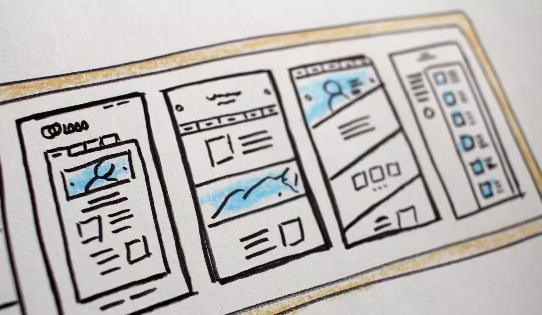
What Is Responsive Web Design?
Responsive web design means your site automatically adjusts to different screen sizes—smartphones, tablets, laptops, and desktops—without compromising usability or performance.
Why It Matters to Cincinnati Businesses
If your site:
- Requires pinch/zoom to read
- Has tiny CTA buttons
- Loads slowly on 4G
- Breaks layout on tablet
…you’re losing leads. Period.
Mobile users are quick to bounce from frustrating experiences. Responsive design increases dwell time, conversions, and Google rankings.
Google Prioritizes Mobile
Since Google’s mobile-first indexing, your mobile site is now the primary version used for search rankings. If it’s broken or slow, your entire online presence suffers—even on desktop.
Our Mobile-First Development Approach
At Social Link, we design mobile-first, then expand for larger screens. That includes:
- Touch-friendly navigation
- Scalable fonts and flexible grids
- Optimized media and lazy-loading
- Fast-loading resources via CDN
- UX testing on multiple devices
Common Pitfalls We Fix
- Overloaded homepage with too many elements
- Fixed-width designs
- Ignored tablet breakpoints
- Mobile menus that don’t work
- Forms that are unreadable on small screens
Conclusion
Responsive design is no longer optional. It’s the baseline for doing business online. If you’re serving Cincinnati customers, your site needs to meet them where they are—on mobile.